Tuesday 24 September 2013

Double Page Spread Analysis

For the same reasons as below, I also analysed the feature article from the same issue of Mixmag - to allow me to identify and understand the conventions used.


The person featured in the article is a famous electronic dance music artist and DJ, so it makes sense that she would be the focus of an article in a dance music and clubbing magazine. She is also around the age of the target audience, being twenty-six, the same age as the median target audience.

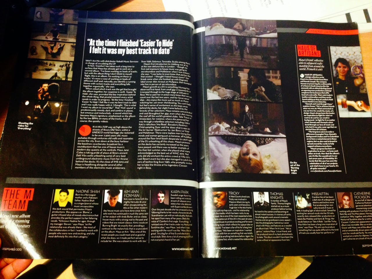
The main colours used for the article are black, white and red. Black is a colour used to make most others stand out in comparison – in this case, it does that with white, which contrasts with it. This creates a strong contrast and makes the text stand out more. The same effect is made with black and red, with the latter looking even stronger than usual because of the contrasting colours. The use of black to make other colours stand out was also used on the front cover of the magazine. The model is also dressed in black and red, wearing the same colours as makeup to stay with the theme. Pictures that feature her in other clothes are in grayscale, as so not to disrupt the colour scheme.

Her costume heavily features red, a colour that can be used to symbolise power or passion. This could reflect on her passion for her work as an artist. It could also make her look like a powerful figure – at least, in the world of dance music. It can also represent energy, and energetic music is considered a staple of electronic dance music. Black can also be associated with power, but may have a darker atmosphere to it. Those that read the article or are familiar with the work of Maya Jane Coles will know that her music has a somewhat gothic style to it, so her costume also reflects her music.

The language used is descriptive and gives a very positive outlook on Maya Jane Coles’ life and music. There is a lot of information about her that doesn’t necessarily need to be known about her – such as her height and the makeup she had on whilst being interviewed. This has the effect, however, of making the reader feel like they know her more and so are closer to her. This could encourage them to look into her music, or buy more of the magazine to find out more about her. The magazine also uses jargon that might not be known to people that aren’t music fans, such as LP (long playing, such as an album) and mentioning the names of various labels and dance artists (Real Tone, Tricky, Kim Ann Foxman etc). This shows that the magazine assumes that its readers will already be familiar with dance music artists and music labels, identifying them as intelligent fans being reintroduced to an old friend. This can be confusing for a new reader, however, as they may not know any of the names or words, which can put them off reading further. The text is also quite informal but still descriptive.

Text on the page is restricted to one of the two pages, with one quote and the name of the featured artist on the other. The remaining space is taken up by some pictures, but there is still a lot of empty space left on the page. Almost all of the second page, for example, is taken up by a large image of MJC, whilst the other page holds the main body of text, which takes up about half of the page. There is a small picture next to the text of Maya to take up some of the remaining space, and also to remind readers what the subject of the article looks like.

MJC is shown looking off to the side on both pictures, as opposed to her looking directly at the audience on the cover. This gives the impression that there is something more important that has her attention, although in one of the pictures we can clearly see she is focused on using a DJ booth. There is nothing that we can see drawing her attention in the other picture, however, making her appear distant. At the same time, this could also give us the impression that she is very focused on and passionate about her music. The shot type – a mid-shot – may have been used to draw attention to this, and the same can be said for the colour’s image – or lack of it. That picture is the only one that is in greyscale. If the image was in colour, the bright colours that are usually seen in a club would have broken the article’s colour scheme and generally distracted the body of text. It also has the added advantage of giving the impression that the artist is very serious about her work as a DJ.

Monday 23 September 2013

Contents Page Analysis

To better understand the conventions used across all pages, I analysed the contents page from the same magazine as well.


The contents page takes up two pages, and a lot of that space is taken up by large images. The images show people (mainly young woman) dancing and listening to a DJ. They are dressed for summer as it can get very hot inside a club, and also because the most popular cities for clubbing (Ibiza, for example) are known to be very hot. All of the people in the main images are clearly enjoying themselves and aren't afraid to show off their body. I know from my earlier research that one of Mixmag's main focuses are clubs and other music events such as festivals. The main images have clearly been taken inside a club, supporting the information that I've gathered. The DJ shown also shows the focus on them.

Black and white are the most prominent colours used on the page. The simple colour scheme still manages to make the text – which is the latter colour – stand out against the background, just as it was used on the cover. Just like on the front cover, the text is small in comparison to the images which occupy a much larger space on the page. The headlines are also in capital letters, just like on the cover, putting emphasis on them so that the reader will be attracted to them and then look to find out more details.

The contents are on the right end of the first page and the left end of the other. This may be because when a reader turns the page, before they have finished doing so they will be able to see the list of contents. This goes for both pages. Each headline has a page number next to it, and they are listed by what kind of article they are, such as 'features' and 'fashion'. Even the images are given large page numbers to direct readers to the relevant articles.

We already know from the front cover that the magazine appeals to the fashion sense of clubbers, so a fashion section is appropriate. There is also a section for 'tunes', which addresses dance music that has recently been released online or on CD. Again, this is only right for a music magazine. There are also ‘cue’ articles, which each focus specifically on one artist, group or DJ. The focus can help readers discover new artists or just find out more about ones they already know.


The magazine's logo is in one of the upper corners on each page. It isn't very prominent, though it is still bigger than all of the headlines on the page, making it difficult for the reader to forget what magazine they are reading. At the bottom of each page is the magazine's website, making it easy to find if and when a reader is interested in reading more online. If the brand has any other franchises, however, they aren't featured on the front page.

Second Analysis of a Music Magazine Cover

I also analysed the cover of Mixmag magazine, a magazine focused on dance music - as I want my magazine to be in the future.


Mixmag is a dance music and clubbing magazine. This is evident from the front cover of the magazine, which lists various famous DJs and electronic music artists, such as Maya Jane Coles and Pretty Lights. The cover also highlights ‘Bestival’, which is an indie/dance music festival, so we know that the magazine will cover several aspects of dance music.

The target audience for Mixmag are people in their early and mid-twenties. The median age of a reader is 26, with 72% of those readers being male and 28% female. Most of their readers have a high income and are outgoing, and so they usually have the latest fashions, gadgets and songs. This is reflected in the magazine’s high prices and using a festival article as a selling point.

The front cover features Maya Jane Coles, a famous British DJ. Her presence on the cover appeals to fans of her, and even just fans of dance music that know of her. In a store, the magazine will be amongst several magazine stores, and people will glance over the image whilst searching for one that interests them. Using a famous artist as a cover model draws in any potential artists that are familiar with her. Even if a fan of dance music does not know who she is, they will see her clothing as similar to their kind of style and be interested. It also works for her as it promotes her work, as regular readers of the magazine that don’t know her will then read about her and learn more about her.

She is using a direct mode of address, which establishes that she wants to make a connection with the audience. It entices a relationship with the audience. The eye contact also makes it look like she is following you across the store when you are searching for a magazine, making them look back at it in return. This makes them give the cover more attention and brings them one step closer to buying it.

The anchorage text says ‘The dark and mysterious world of the underground’s biggest star’. This, in addition to the image of her, makes her come off as enigmatic, which makes readers curious. This will make them want to buy the magazine so that they can find out more about her. Calling her the ‘biggest star’ also lets the audience know of her fame even if they don’t know her, and can convince those that don’t know her to read on so that they can stay up to date.

Overall, she comes off as a mysterious character, as the anchorage text implies. Her clothing and hairstyle also makes her look quite trendy, however, and somebody that the audience would want to dress like. The fashionable look also helps to draw in readers, not only because she looks good, but because she is wearing the kind of clothes that clubbers would wear when they are going for a night out. This also does a good job of representing clubbers, as they are the type of people that would buy the magazine.

The title 'Mixmag' tells readers from the start what kind of magazine they are going to read. 'Mix' is short for 'remix', which is what DJs often do to a song to make it more orientated to the dance genre. The title could be considered short for 'Remix Magazine', telling the readers that it is about dance music and DJs. The font used for the title is rounded, unlike most other text on the cover. The smooth text gives it a more modern feel, which is appropriate since dance music is a relatively new genre.

There is only one buzz word on the magazine cover. The word ‘plus’ is used to list a number of dance music artists and DJs. This gives the impression that there will be many articles inside the magazine, each covering at least one of the artists listen. It can make a potential reader think that the magazine is packed with content and thus believe that they are getting their money’s worth, which will help convince them to buy the magazine.

The puffs list several DJs, dance music artists and festivals. Being a magazine centred around dance music and clubs, it is quite clear that the magazine will feature articles regarding those groups and places. The magazine clearly expects to attract people that go to clubs or enjoy reading about what happens at them.

The magazine’s slogan is used as a skyline, and reads: ‘The world’s biggest dance music and clubbing magazine’. Its position at the top of the page makes it one of the first things viewers will see when they look at the cover. The claim is one that will surely interest any clubber that looks over the cover.

The model, who takes up a lot of the cover, is wearing black and red clothes and make-up. Black is a colour used to make other ones stand out, and it does this job well for the red featured on the cover and the neon pink used for the text. The brown background is a subtler colour compared to these two. All text, with the exception of the logo and the credits, is in capital letters, which are used for entire words or sentences to give emphasis to it.

In addition to everything else, the magazine comes with a cover mount. A free CD is attached to the copy, which holds over a dozen dance music tracks from various artists, several of which are featured in the magazine's articles. A free object is enough to get most people's attention, but when the object is designed to appeal to something the reader already likes (if they are looking at a dance music magazine, it is assumed they have some interest in dance music) it may be enough to get them to buy it, especially if they recognise one of the artists listed on the CD.

Thursday 19 September 2013

Analysis Of A Music Magazine Cover

Another piece of research I did was an analysis of an actual music magazine cover. Kerrang! is one of the most popular music magazines in the country, and so a front cover for their magazine is expected to have most, if not all conventions of a music magazine cover. By analysing it, I am able to see why conventions are used and apply them to my own front cover when I start to design it.


The magazine that I am analysing is a music magazine that puts a focus on rock music. The front cover has the names of various rock bands and artists. Some of them have quotes – “I’m thankful to be alive” telling us that there will be an interview, or at least an article with some comments from the person in question. The anchorage text ‘Scorching Australian Tour Report’ is an indication that there will also be an article on those bands and their performances in the magazine.

The target audience of Kerrang! Magazine is young people aged 16-24. The magazine targets both males and females, but leans more towards males. Their interests would obviously include rock music or just one particular rock artist.

The model in the central image is using an indirect mode of address. He has glasses on to hide his eyes from the audience, but his head is turned up and away from us anyway. This suggests that he is supposed to be too busy playing the guitar to look at the audience, and that he is enjoying himself. The shot type used also reflects on this. A midshot is used, which points more focus on his pose. The pose is clearly him ‘rocking out’, which means that the shot is drawing attention to the fact that he is performing and most likely enjoying himself too.

The model is Jared Leto, who is a member of the band 30 Seconds to Mars. They are a famous rock band, and the magazine focuses on rock music, so it’s only appropriate that a rock artist is featured on the front cover. The anchorage text lists his band, among others as one of those being covered in a report, which tells us that the group is still active. Altogether, we get the impression that Jared is busy playing his songs alongside his other band members.

A general stereotype of rock fans is that they often wear the colour black, dressing like ‘emos’. The artists featured on the cover certainly dress in that manner and wear that style of makeup, which reflects well on that community. The outgoing fans are also catered to with the reports of tours promised in the magazine and a guide to gigs.

There are many buzz words used to draw in any potential buyers. ‘WIN’ in capital letters is an eye-catcher to people scanning over the cover because of the chance of a reader winning a prize. The word ‘FREE’ also a similar effect, since it implies that anybody that buys the magazine will get a bonus item.

The masthead uses a stylised font that makes it look like the text has been smashed. This creates a look of disorder and chaos, which is a theme often reflected in rock music. Since the magazine mainly covers rock music, this is appropriate and does a good job of telling the audience of the magazine’s theme right from the start. Kerrang is the sound made when a power chord is played on an electric guitar, one of the most commonly used instruments in rock music. Therefore any person familiar with the genre would recognise the sound when they read it in their head and know that the magazine was one about rock music. The bold font also makes the title look ‘loud’, just like with rock music.

The puffs suggest the magazine will feature several interviews from famous artists. The pull quotes alongside the names of artists give this idea to potential readers. From that, we know that the magazine aims to attract people that are interested in finding out more about their favourite artists and bands. Even the puffs that aren’t covering interviews imply that they will cover aspects of the artists’ personal lives. ‘Back to where it all began...’ underneath the Foo Fighters, for example, tells us that the article featuring them will explore parts of their past.

Red, black, white and yellow are the colours used for the cover. Red is a colour of violence and aggression, and rock music tends to sound quite aggressive, so it matches the theme of the magazine. The black and white contrast against each other, which makes the text stand out and look bold. Yellow is also a strong and bold colour which stands out against black or white.

The competitions and posters offered on the front cover are a means of attracting potential buyers, as free gifts are always a bonus to people. The feature of a famous artist as the cover model and main image also draws in people that like that artist. The other pictures of various other rock artists hold the same effect, acting as graphic features. The skyline, claiming that the magazine contains ‘The UK’s biggest gig guide’ will also attract outgoing readers that are looking for a concert to go to.

Tuesday 17 September 2013

Conventions Of A Magazine Cover

This is my annotation of a music magazine cover, detailing the conventions used on it. This will help me to design the cover page of my magazine, as it allows me to recognise the common features that will help to draw in buyers.

Preliminary Task: Contents Page

This is my contents page for my preliminary task. I used Adobe Photoshop CS6 to add text to an image of the model I took a picture of. Like with the cover page, I had to learn basic editing skills in order to resize and crop the image so that it was the right shot type. I then had to copy the logo from the cover page and add it to the front page. I then used the text tool to add in a title and the contents.


Preliminary Task: Cover Page

This is my cover page for my college magazine. I used Adobe Illustrator CS6 to edit text and images onto a picture I took of my model. I took inspiration from the models and shots often used for mainstream magazines to make my own cover image. In the process, I learned the basics of Illustrator to add text to the image. I also used Photoshop to crop the image to make it the right shot type, as well as add the barcode in.

Sunday 1 September 2013

Blog Introduction

Hey! My name is Adelaide and I'm sixteen years old! I am a AS-Level Media student at Bishop Challoner Catholic Collegiate Sixth Form. I enjoy Media Studies as it is a means for me to learn about how the various forms of media use techniques and conventions to give its audience the viewpoint they desire. I also like its creative side, which I'll showcase here!

This is my AS Level Media Portfolio, where you can see my music magazine, and all of the planning and research I did leading up to it.